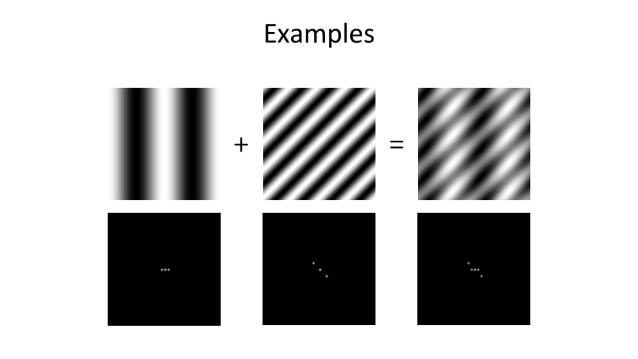
I just want to check my understanding here. k_x and k_y the axis for the "black graphs" those are the axis for if we plotted the frequency in 1D.
When we look at he fourier transform images later in the lecture we're once again looking at these frequency maps but with much more complciated signals.
Why do we plot the anti-symmetric part again?
mpotoole
Yes---$k_x$ and $k_y$ are the axis for the images on the bottom.
The image on the bottom is symmetric (Hermitian symmetric to be precise) because the images above are real-valued; more details in a comment on this slide. As for why do we plot both components? It's just the standard way of visualizing the spectrum.
Here's a perfect chance to plug the new notebook tab on the website. In the lecture 3 notebook, there's a demo of this slide. Try playing around with it! You can even change the code to experiment with this further.
I just want to check my understanding here. k_x and k_y the axis for the "black graphs" those are the axis for if we plotted the frequency in 1D.
When we look at he fourier transform images later in the lecture we're once again looking at these frequency maps but with much more complciated signals.
Why do we plot the anti-symmetric part again?
Yes---$k_x$ and $k_y$ are the axis for the images on the bottom.
The image on the bottom is symmetric (Hermitian symmetric to be precise) because the images above are real-valued; more details in a comment on this slide. As for why do we plot both components? It's just the standard way of visualizing the spectrum.
Here's a perfect chance to plug the new notebook tab on the website. In the lecture 3 notebook, there's a demo of this slide. Try playing around with it! You can even change the code to experiment with this further.